ARTIST STATEMENT
Whether using fiber, paint, drawing, or printmaking, Jan Brandt’s artwork is an invitation for viewers to invest more time in their perusal of the composition.
Ambiguity, achieved partly through abandonment of traditional perspective, directs the eye to discover serendipitous moments. There is a tension between using both representational and abstract depictions that slows down the process of interaction, resulting in more time considering the piece.
A sense of movement is important. This is partly achieved by choosing expressive, organic linear work. The change in scale of similar shapes, especially circular, and repetition throughout the picture plane leads the eye throughout the picture plane. The fluidity of organic elements works toward the goal of perceived movement as opposed to more static geometric elements.
Using color in context is clearly a preference of Brandt’s to elicit a sense of movement. The contrast between complementary colors activates the eye and makes the composition pop. Dynamic, high key color is arresting and commands attention. Considering the power of color even when mixing low intensity neutrals can change a resting point to another opportunity for excitement. For example, if yellow is utilized, a grayed out, neutralized violet next to it enlivens the composition much more than a standard gray mixed with black and white.
Non-linearity, the fragmentation of both representational and abstract depictions, and the joyful use of color theory are the basis for Brandt’s work. Using these tools, the artist’s aim is to prolong viewing time, allowing for the potential for a fulfilling visual experience.
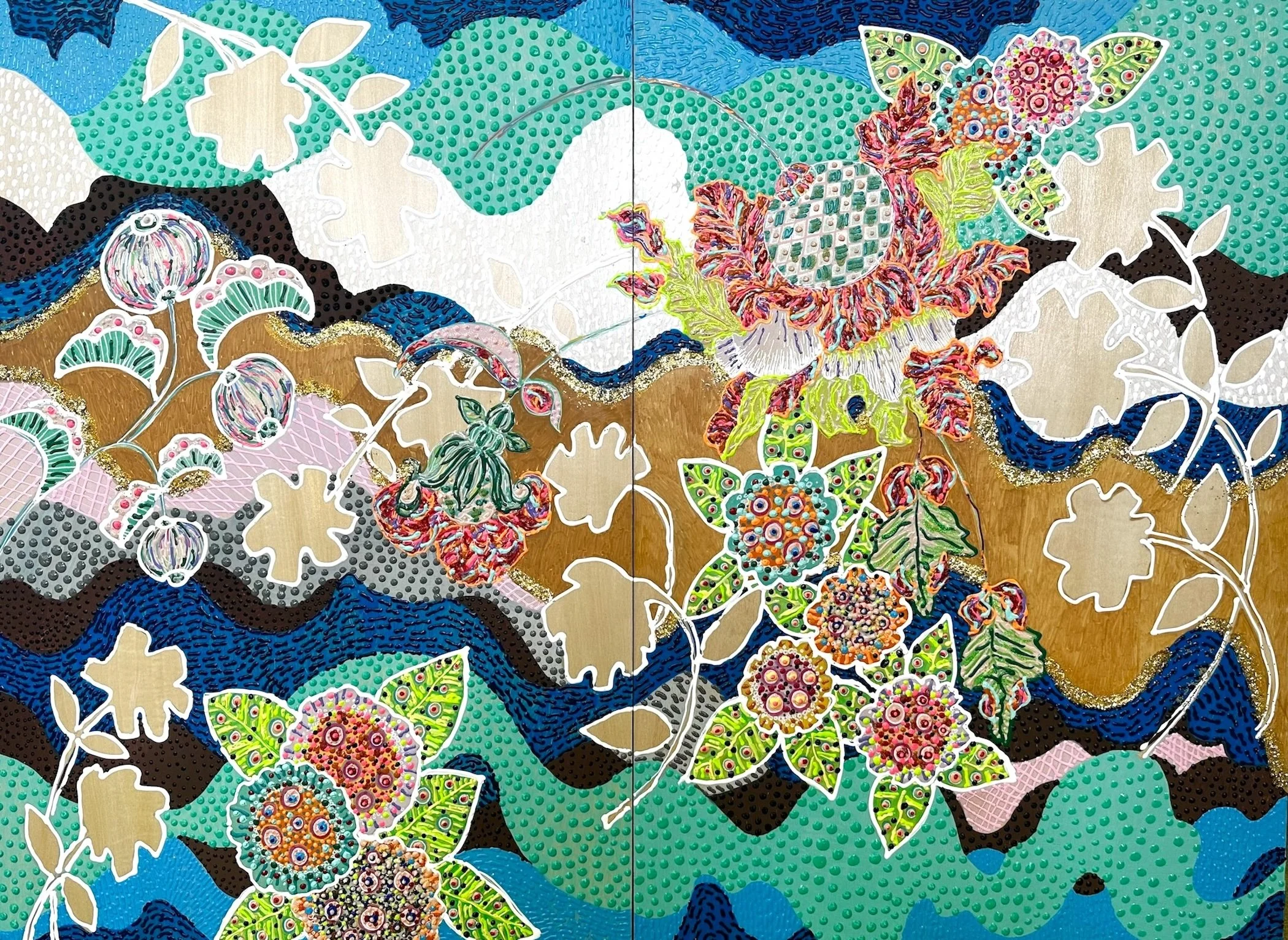
Brandt’s latest painting series is a confection of vivid colors and densely arranged organic patterning influenced by ornate Jacobean tapestry, 18th-century botanical drawings, and Swedish floral designs. A longstanding interest in the decorative and applied arts has built an awareness and admiration in the artist to these influences.
Studies of the Pattern and Decoration Movement, popular in the 1970’s-1980’s have led to an appreciation of that aesthetic and message that still rings true for Brandt. The validity and acceptance of art based on “Women’s Work” and Non-Western influences (premises of the Pattern & Decoration Movement) challenges the dismissal of these expressions by a majority of the male dominated art world
The palpable quality of the “Hothouse” paintings is informed by the multimedia artist’s longstanding practice with fibers. Texture is literal. Dots of craft puffy paint dry into applied pointillism. Crunchy glitter is used unapologetically for added contrast, texture and beauty. Less is not more in these maximalist creations.
Anchored in a narrative based on childhood observations of the family farm, her sensitivity towards natural surroundings is augmented by visiting greenhouses, arboretums, and botanical gardens. Enveloping our senses, The “Hothouse” paintings are a visual translation of lush colors, fevered temperature, curious sounds, and sensual fragrances often produced by a greenhouse experience. Per the artist’s design, one initially perceives each work or exhibition from a holistic point of reference then begins an investigation into specific details by visually dissecting individual sections of Brandt’s bountiful and cleverly indulgent composition.
